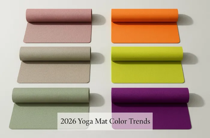
Walk into any mid-size yoga studio in a North American or European city and look at the wall of hanging mats before the morning class fills in. In 2024, that wall was loud — electric teal, coral pop, acid green. Heads turned. Instagram posts happened. The mats photographed beautifully under studio lighting.
By early 2026, those same studios are quieter. The mats hanging on the wall are sage, warm clay, dusty slate, and a particular shade of muted rose that doesn’t have a clean name but reads immediately as considered. The eye doesn’t catch — it settles. Members stop to look because the color asks them to stay, not because it demands attention.
That shift — from saturation to de-saturation, from pop to Morandi — is not a mood. It is a purchasing signal. And for B2B buyers building a yoga mat product line or specifying studio supply for 2026–2027, reading that signal correctly is the difference between ordering colors that move and ordering colors that sit.
This guide is not a trend report. It is a buying framework: what the Morandi-versus-saturation conversation actually means for the OEM decisions you need to make, where the production risk lives in each direction, and how to structure a color assortment that doesn’t embarrass you six months after the goods land.
Quick Summary
- Morandi tones — muted, desaturated, sophisticated grays, greens, and pinks — dominate 2026 studio and premium retail purchasing. They photograph quietly, age gracefully, and signal a maturity of brand voice that mass-market saturation no longer achieves.
- High-saturation colors remain the correct choice for specific channels: mass retail displays, entry-level product lines, and promotional or seasonal SKUs where impulse purchase matters more than longevity of feel.
- Morandi compound color production is technically harder than saturated colors. The margin for error on a muted sage is smaller — a 10% drift toward yellow reads as dirty; a 10% drift toward blue reads as cold. Getting a Morandi tone right requires a physical sample approval, not a Pantone number alone.
- The inventory risk of trend colors is a supply chain problem, not just a marketing problem. A color that peaks at retail while your production run is still in progress leaves you holding goods that are already starting to feel dated on arrival.
- PU and TPE surfaces take color differently. A Morandi sage on TPE compound reads warmer; the same Pantone reference on a PU surface reads slightly cooler and more saturated. Approve both surfaces separately if your product line spans both materials.
What Morandi Actually Is — and Why It’s Happening Now
Giorgio Morandi was a mid-twentieth century Italian painter known for his still lifes of bottles and vessels. His palette was deliberately constrained: muted ochres, gray-greens, dusty pinks, warm whites. The colors were recognizably real but drained of intensity — as if seen through a linen curtain. Nothing demanded attention. Everything rewarded looking.
The term “Morandi tones” entered the design and product vocabulary through Chinese social media around 2022 and accelerated into global lifestyle product design by 2024. In yoga mat terms, it describes any color that has been desaturated — where the original hue has been mixed with its complement, with gray, or with white until the loudness is gone and only the quality remains.
Sage green is Morandi. Not because it is green — because it is the version of green that has been quieted until it stops performing. Dusty rose is Morandi. Warm taupe. Soft slate. The blue that looks almost gray. The terracotta that has been diluted until it reads as warm sand rather than clay.
Why is this happening now, and why does it matter for B2B buying decisions?
The answer is not aesthetic. It is behavioral. After several years of maximalist color in the wellness and fitness category — the electric teal era, the neon phase, the coral moment — the buying population that drives premium yoga mat purchasing has developed a specific aversion response. High-saturation color in a wellness context now reads as effort, as marketing, as noise. Morandi reads as confidence: a brand that doesn’t need to shout.
For a B2B buyer, the practical implication is this: a product line built around Morandi tones is positioned at the customer who has already bought two or three yoga mats and knows what they want. The saturated-color buyer is still in the market — they are just a different buyer, in a different channel, at a different price point.
The Production Reality of Morandi: Where the Difficulty Lives
Here is what the trend reports don’t tell you.
Morandi compound color is harder to produce accurately than saturated color — and the margin for error is narrower on the production floor.
When a factory mixes a saturated coral, they are adding dye to a base compound and stopping when the color is bright enough. There is a reasonable range of “correct coral” — the eye is forgiving of small dye variations because the saturation masks them.
When a factory mixes a Morandi dusty sage, they are doing something more difficult. They are adding small amounts of multiple dyes to achieve a color that is green but not quite green, warm but not quite warm, and specifically not any of the wrong versions of that description. The difference between “muted sage that reads as sophisticated” and “faded green that reads as dirty” is a dye mixing variance that might be as small as 5% of one component.
The consequence of getting it wrong is not subtle. A Morandi color that drifts slightly yellow in production looks unwashed. A Morandi tone that drifts slightly blue looks cold and corporate. Neither mistake is obvious until the production sample arrives and sits next to the approved reference — at which point you have a decision about whether to approve, reject, and re-run.
What this means for your OEM specification:
Never approve a Morandi compound color from a Pantone number alone. Pantone references are formulated for coated paper stock — the same Pantone number on a foam compound, a PU surface, and a printed textile will produce three different visual results. The foam scatters light differently than paper. The PU surface has a slight sheen that shifts the perceived hue. The textile absorbs dye at a different rate.
The correct process for Morandi color approval: 1. Provide the Pantone reference as a starting point 2. Request a physical foam compound sample (not a product, just a compound chip) for initial color review 3. Approve or redirect the compound chip before full sample production 4. Approve the full sample mat under your expected end-use lighting conditions (studio ambient, not the factory’s fluorescent overhead)
That last point matters more than it sounds. A dusty rose that looks correct under the factory’s lighting looks visibly pink-orange under warm tungsten studio lighting. Approve your color sample in the environment where your customer will see it — not where it was produced.
High-Saturation Colors: The Case and the Risk
High-saturation yoga mat colors — the electric teals, the hot corals, the pop yellows — are not dead. They are channel-specific.
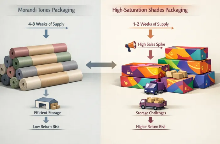
Pick up a saturated coral yoga mat at a retail price point under $35. The weight of it is lighter than a premium mat. The surface texture catches your fingers differently. And in a retail display under fluorescent big-box lighting, it stops your eye in a way that no Morandi sage will. The saturation is doing commercial work — it is generating the impulse engagement that moves entry-level product.
That same saturation looks wrong in a premium studio retail context. Not wrong as in ugly — wrong as in misaligned. A member who pays $180/month for studio membership expects the retail shelf to match the quality of the experience they’re paying for. A hot coral mat on that shelf reads as a product placed in the wrong location, regardless of its actual quality.
The inventory risk of saturated trend colors:
High-saturation colors that emerge as “trend colors” — the specific teal of a particular season, the coral variation that was everywhere for eight months — carry a supply chain timing risk that Morandi-adjacent colors do not.
Evergreen Morandi tones (warm gray, dusty sage, slate blue, warm sand) cycle slowly. They appear in market, build over 18–24 months, and phase out gradually. A buyer who over-orders a warm gray has a problem measured in months — the color may not be “fresh” next season, but it is not obviously dated.
A saturated trend color peaks and crashes faster. The specific coral that dominated studio retail in Q1 can feel stale by Q4 of the same year. A buyer who committed a 500-unit production run to that color in March, received goods in June, and is looking at unsold inventory in October is holding product that the trend window has passed.
The buying discipline for high-saturation trend colors: smaller production quantities, faster sell-through requirements, and a clear plan for what happens to remaining inventory if the trend window closes before the goods move. A Morandi color can be carried into the next season. A peaked trend color usually cannot.
The 2025 Baseline: What Was Selling Before Morandi Peaked
Trend direction is easier to judge against the year that preceded it. The 2025 US retail picture looked like this: green led the category, with earth tones — brown, beige, soft gray — building steadily behind it. That earth-tone build was the early Morandi signal, visible a full year before trend reports named it. Pink held a stable niche in the home-practice segment, and black and navy did what they always do — moved consistently across every channel without ever appearing in a trend report.
Two merchandising patterns from that year are worth keeping on file because they repeat:
Color preference tracks practice style, not just fashion. Restorative and meditation-adjacent buyers skew toward blue, green, purple, and pastels; vinyasa and higher-energy formats pull warmer saturated tones; hot yoga buyers disproportionately choose black and navy. A brand serving a specific studio format can weight its color assortment accordingly instead of spreading evenly.
Dark colors are an operations decision as much as an aesthetic one. Black, navy, and deep green hide sweat marks and stains — which is why studio bulk buyers default to them for house mats regardless of what the retail trend is doing. When a studio chain’s RFQ asks for dark colors only, that is maintenance logic, not conservatism.
The takeaway for 2026 buying: Morandi did not arrive suddenly. It grew out of the 2025 earth-tone base, which means it has the adoption curve of a maturing preference rather than a spike — relevant when you decide how much of a production run to commit to it.
How to Read Color Trends for OEM Buying Decisions
Trend forecasting reports are useful background. They are not buying instructions.
A trend report tells you that dusty sage is ascendant for 2026. It does not tell you whether dusty sage is right for your specific channel, your existing product line architecture, your customer’s purchase cycle, or your factory’s compound mixing capability. Taking a trend report color and putting it directly into a production order without those filters is how brands end up with colors that feel right for three months and then quietly collect dust.
The buying filter that actually matters has four questions:
1. Does this color fit your channel’s purchase cycle? Mass retail moves color quarterly. Premium studio supply moves color seasonally — spring/fall — with slower rotation. DTC brands move color annually or slower. A color that is right for mass retail’s Q2 push may be past its peak window by the time it reaches a premium DTC brand’s annual restock.
2. Is this color in your existing assortment’s conversation or is it isolated? A Morandi sage that coordinates with your existing warm gray and dusty rose reads as a coherent brand voice. A Morandi sage dropped into a line of saturated colors reads as an anomaly. Color sells in relationships, not individually — especially in a studio retail context where members see multiple SKUs together.
3. Can your factory compound-match this color to your standard? Some factories have strong capability in saturated colors but limited experience in Morandi compound mixing. Ask for a compound chip on any new color before committing to a production run. A chip takes one to two weeks and costs nothing. A rejected full sample run costs four to six weeks and re-run negotiation.
4. What is your inventory exit plan if the color doesn’t move? Every production color commitment needs an answer to this question before the PO is placed. A neutral Morandi tone can often be re-priced and moved through the channel as a “foundation” color. A peaked trend color typically cannot be repositioned without significant markdown.
OEM Color Specification: The Gap Between Reference and Result
The moment a production sample arrives in a color that is visibly wrong — not catastrophically wrong, just wrong enough that you know you cannot approve it — is an expensive teaching moment. The color looked correct in the digital reference, in the Pantone chip, in the factory’s email confirmation. Then the foam sample arrived and something is off.
That gap between reference and result has a specific cause. It is not quality failure — it is material-translation failure. Every material surface translates color differently because every surface scatters, absorbs, and reflects light differently.
TPE foam compound scatters light softly and reads color with a slight warmth. A neutral gray on TPE compound tends to read slightly warm — more beige than the Pantone reference suggests. A cool blue-gray on TPE often needs to be mixed slightly cooler than the Pantone reference to arrive at the intended neutral.
PU surface mats have a slight surface sheen that intensifies perceived saturation. The same Morandi sage that reads as quiet and muted on a TPE compound reads 10–15% more vivid on a PU surface because the sheen is reflecting a higher proportion of light back to the eye. If your product line includes both TPE and PU yoga mat formats, you need two separate color approvals — not one Pantone applied to both.
Printed sublimation colors behave differently from compound colors entirely. A Morandi background created through sublimation printing can be designed to exact RGB values, but the heat transfer process produces a slight color shift toward warmth. Proof prints should be approved in production before committing to a full print run.
When you walk through these three material surfaces mentally before ordering, the specification conversation with your factory becomes more productive. Instead of “Pantone 7494 C,” the specification reads: “Pantone 7494 C as starting reference; compound chip approval required before sample production; note target reads slightly cooler than standard Pantone translation on TPE.”
That single sentence prevents most Morandi color approval problems before they happen.
Channel Fit by Color Category
| Color Category | Studio Premium | Studio Retail Shelf | Mass Retail | DTC Premium | Corporate Wellness |
|---|---|---|---|---|---|
| Morandi neutrals (warm gray, slate, sand) | ✓ Primary fit | ✓ Good | ⚠ Low impulse | ✓ Primary fit | ✓ Good |
| Morandi tones (sage, dusty rose, clay) | ✓ Primary fit | ✓ Primary fit | ⚠ Limited | ✓ Primary fit | ⚠ Specific programs |
| Saturated classics (black, deep navy) | ✓ Good | ✓ Good | ✓ Good | ✓ Good | ✓ Good |
| Saturated trend (coral, teal, pop) | ⚠ Misaligned | ⚠ Short window | ✓ Primary fit | ⚠ Short cycle | ✗ Off-brand |
| Seasonal limited (holiday, campaign) | ⚠ Low relevance | ✓ Promotional | ✓ Good | ✓ Campaign | ⚠ Specific use |
⚠ = can work with specific positioning · ✗ = channel mismatch
How to Structure a Color Assortment for a Production Run
For brands building a yoga mat color assortment, three color categories work together:
Foundation colors (60% of production). Colors that sell consistently across seasons and channels without a trend dependency. Warm gray, slate, black, natural off-white. These are the SKUs that remain in the line indefinitely and anchor the assortment. They carry the highest inventory confidence because they do not require a trend window to move.
Trend-adjacent colors (30% of production). Colors that align with current trend direction without being dependent on peak trend timing. Morandi sage, dusty rose, warm clay — colors that are clearly informed by the current Morandi moment but will read as considered rather than dated in 18 months. These are the colors that make a product line feel relevant without creating the inventory risk of pure trend commitment.
Trend accent colors (10% of production). One or two colors that are genuinely trend-specific — the specific teal of the moment, the season’s coral variation. Small production quantities, tight sell-through windows, clear exit plan. These generate social content and retail freshness without creating overexposure.
This structure keeps the majority of production committed to predictable-moving SKUs while maintaining the trend relevance that makes a product line feel alive.
FAQ
How far in advance should we commit to a color for a production run?
Lead time from color approval to goods delivered runs 10–14 weeks for most yoga mat orders (2 weeks sample, 35–40 days production, 22 days sea freight to US West Coast). To arrive for a spring sell-in, color must be approved by late November at the latest. For fall sell-in, color approval by early May. Trend reports for a given season typically publish 6–12 months in advance — which means you are making your color commitment during the prior season’s sell-through. Reading what is actually selling in your channel now, rather than what the trend report says will sell next season, is usually a better input.
Can we match a competitor’s color without a Pantone reference?
Physical matching from a competitor’s product is possible. Send the factory a physical sample of the target color (the competitor’s mat, a paint chip, a fabric swatch — any surface that holds the reference color). The factory’s color team will mix a compound chip to match. This process takes 2–3 weeks for the first chip and an additional 1–2 weeks for any correction rounds. Physical matching is often more accurate than Pantone-referenced matching for unusual or Morandi-adjacent tones, because it removes the material-translation step.
How many colors can we run in a single production order?
Most factories can accommodate 3–5 colors in a single production order without complexity penalties, provided each color meets the minimum order quantity per color (typically 100–150 units). Orders with more than 5 colors in a single production run require production scheduling discussion — the factory needs to sequence color changes on the production line, and too many color changes in one run can affect lead time. For brands wanting a wide color assortment, splitting across two production runs 4–6 weeks apart is often more efficient than a single large mixed-color run.
Does PU yoga mat color hold better than TPE over time?
Yes, in most use conditions. PU surface mats tend to hold color fidelity longer than TPE foam mats because the PU surface layer is more resistant to UV exposure and surface abrasion. TPE compound color is embedded throughout the foam but can show surface discoloration from cleaning product accumulation and UV exposure in high-window studios. For a studio supply application where mats will be used and cleaned daily for 12–18 months, PU surface mats offer better color consistency over the product’s lifespan. For a retail product where the mat lives in a carry bag between uses, the difference is less significant.
Should we photograph the mat in studio light or product photography light before approving a color?
Both, ideally. Approve the physical color sample under your target end-use lighting first — studio ambient, typically warm-white at 3,000–3,500K. Then photograph the approved sample under product photography conditions (daylight-balanced, 5,500K or above) to confirm the digital representation is accurate for your product listing. A color that reads correctly in studio ambient but shifts significantly under product photography lighting will generate customer expectation issues when the product arrives and is placed in a real-light environment.
Related reading:
– Yoga Mat Materials Compared: TPE vs PU vs Cork vs PVC — how material choice affects color translation, surface appearance, and color longevity across the mat’s lifespan
– How to Personalize Yoga Mats for Your Activewear Brand — color coordination between mat specification and brand identity, including print and compound color alignment
– Bulk Yoga Mat Orders: MOQ Tiers, Unit Pricing, and Lead Times — production quantities and timing for color assortment orders
– Full yoga mat range and available specifications — standard and available color options across TPE, PU, and cork formats