For a successful yoga mat launch in 2026, the right color palette isn’t just about standing out in a crowded market—it’s about streamlining your logistics and inventory management. While it’s tempting to focus on aesthetics, experienced teams are thinking about how color choices impact sales performance, meet MOQ requirements, and ensure consistency during reorders. Here’s how you can make the best packaging and color decisions for long-term success.
Success looks like this: 30/60/90‑day sell‑through above channel medians, weeks of supply stabilizing in the 4–8 range, GMROII trending up, and markdowns contained. Let’s dig in.
Signals Shaping 2026 Yoga Mat Color Trends
Pantone’s 2026 Color of the Year, PANTONE 11-4201 Cloud Dancer, is a calming neutral that reflects clarity and openness. Ideal for creating a foundational color palette for yoga mats, this versatile shade works seamlessly when paired with vibrant accents. As showcased in Vistaprint’s 2026 color trends, this combination balances soothing tones with striking color pops, making it a strategic choice for brands looking to enhance both e-commerce and retail visibility. These color pairings can boost consumer engagement and enhance product imagery, emphasizing the need for a dual-portfolio strategy that aligns with both brand identity and sales performance.
Media reporting captured the cultural debate around choosing a white as Color of the Year while still acknowledging Pantone’s rationale about calm and focus, as detailed by Artnet in late 2025. Meanwhile, platform‑level signals from Pinterest—summarized by Elle Decor in January 2026—highlight saturated hues (Persimmon, Cool Blue, Jade, Plum Noir, Wasabi) rising alongside soothing neutrals. The net effect is not either‑or; it’s both.
On social performance, remember that format and consistency tend to drive engagement more than any single hue. Guidance from Sprout Social shows Reels and carousels outpacing static posts; color supports identity, but distribution mechanics do the heavy lifting.
- According to the official context in the Pantone Color of the Year 2026 hub and its artist notes on Cloud Dancer, the shade acts as a harmonizing base tone.
- For practical neutral‑bright pairings, see Vistaprint’s applied palettes in its 2026 color trends coverage.
- The public discourse and Pantone rationale are summarized in Artnet’s 2025 report on the announcement.
- Pinterest’s saturated palette for 2026—Persimmon, Cool Blue, Jade, Plum Noir, Wasabi—is recapped by Elle Decor’s January 2026 feature.
- Platform mechanics over hue are emphasized in Sprout Social’s Instagram trend guidance.
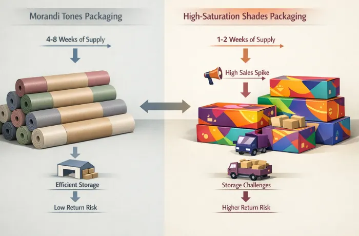
While Pantone’s Cloud Dancer sets the stage with its calming neutral tones, other color palettes like the Morandi-inspired shades provide a softer, timeless approach. These colors align perfectly with long-term sales goals and create versatile, cross-channel appeal.
Morandi colors, such as dusty rose, sage, and greige, embody a strategic approach to color selection with their soft, muted tones. These hues offer more than just aesthetic value; they are functional choices that withstand seasonal changes and maintain relevance across multiple markets. Morandi shades are less likely to experience style fatigue, making them ideal for long-term product lines and core SKUs. Their universal appeal across both e-commerce y retail channels contributes to consistent sales performance, while also helping to reduce return rates due to their enduring, versatile nature.
Morandi Colors — Soft Power That Sells Across Channels
Morandi colors, including dusty rose, greige, sage, and clay, are desaturated hues that embody calmness and elevated sophistication. These timeless tones have wide appeal across diverse environments, making them an ideal choice for multichannel success. For instance, leading brands like Manduka PRO™ have effectively integrated these colors into their yoga mat collections, complementing studio decor or lifestyle apparel.
In Direct-to-Consumer (DTC) sales, Morandi tones photograph exceptionally well, presenting a clean aesthetic without the need for intensive color correction. This makes them an excellent choice for long-lasting product lines, as they maintain their appeal across seasons, ensuring minimal product turnover and consistent sales. By anchoring your collection with these shades, you can build a reliable product offering that resonates with customers year-round.
Why does that matter for sell‑through? Wider acceptability expands the pool of potential buyers and reduces return risk. Morandi‑like tones typically endure across seasons, making them strong candidates for core SKUs. They also camouflage minor scuffs and dust better than ultra‑bright finishes, which helps perceived quality on the sales floor.
Execution notes: Define your target shade using the Pantone TCX color guide, and set a color tolerance range (typically recommended between 1.0 to 1.5). Keep a standard color swatch as a reference. By using digital color management methods, you can speed up the approval process for color samples. In simple terms, this means relying on precise data to ensure color consistency, rather than just visual judgment.
- Datacolor’s overview of a fully digital color management workflow shows how approvals speed up when data leads.
- X‑Rite’s primer on tolerancing methods and calibration clarifies DE2000/CMC choices and QC alignment.
While Morandi colors provide a steady, timeless foundation, high-saturation shades add a dynamic pop that demands attention. These vibrant colors are perfect for short-term visibility and social media engagement, providing the necessary contrast to create an engaging product portfolio.
High‑Saturation Shades — Controlled Bursts of Attention
High-saturation shades like persimmon orange, wasabi green, jade, and vibrant plum son attention-grabbing colors that work exceptionally well in both retail environments and on social media platforms like Instagram y TikTok. These colors are powerful tools for boosting brand discovery y engagement—especially among younger, trend-focused consumers. However, their boldness also presents a challenge: the demand for bright colors can be unpredictable, leading to higher return rates depending on regional preferences. For brands, the key to success with these colors lies in intentional inventory management—starting with smaller initial orders, monitoring real-time sales data, and scaling up production strategically to avoid costly markdowns and overstocking.
So, how do you capitalize while containing risk? Start smaller on initial buys, gate wholesale brights behind commitments, and define tight replenishment triggers based on velocity and weeks of supply. If a bright hits, you can scale with confidence; if it misses, you can reallocate without heavy markdown damage. On Instagram and TikTok, lean on format—Reels, carousels, UGC—and cohesive styling; the hue is the accent, not the strategy.
The key to leveraging both high-saturation colors and neutral tones lies in finding the right balance. By anchoring the majority of your collection in softer, Morandi-inspired neutrals and using high-saturation hues as accents, you can create a harmonious and dynamic product line.
Choosing Your Mix With a Quiet–Loud Portfolio
For a successful 2026 yoga mat collection, the key to balancing inventory and ensuring strong sell-through is to anchor 60-80% of your range in Morandi-inspired neutrals, leaving 20-40% for high-saturation accent colors. This mix ensures your collection is adaptable across channels, providing safe, versatile options for customers while experimenting with bolder choices. Before launching any bright, make sure your line includes at least one light neutral, one mid-tone neutral, and one deeper neutral to create a cohesive and well-rounded offering. This strategy not only enhances product appeal but also helps manage inventory and markdown risks more effectively.
A useful mental model is markdown insulation. Pick brights that can migrate to secondary channels or promotional moments without harming brand equity. And keep a two‑season horizon for muted cores so you can invest in deeper safety stock when data proves them out.
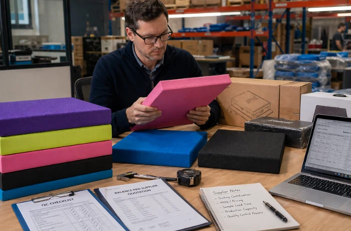
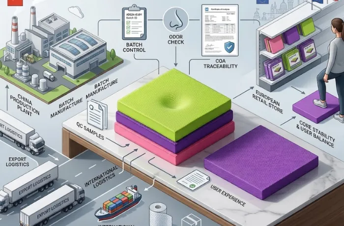
Once you’ve selected the right mix of neutrals and brights, the next challenge is ensuring that these color choices align with manufacturing capabilities. Understanding the limitations of your OEM/ODM partner, including MOQ requirements, will be crucial to executing a successful launch.
OEM/ODM Execution Constraints That Make or Break 2026 Launches
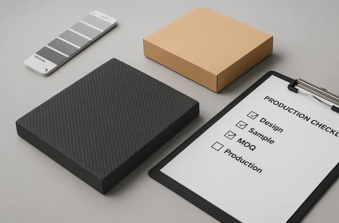
One of the key constraints when launching a custom yoga mat collection is the per-color MOQ (minimum order quantity). Different materials and finishes will have different MOQ ranges. For instance, TPE and PVC mats often require 300–1,000 units per color depending on factors like thickness, embossing, compound, and print method. Natural rubber mats with PU tops may require 100–500+ units for custom shades. When placing your order, confirm these details with your supplier early to avoid unexpected cost hikes and scheduling delays. Lower MOQ runs can increase unit cost and disrupt your production timeline, so it’s crucial to plan ahead.
Color control. Always specify Pantone TCX with illuminant and instrument settings in your tech pack. Set ΔE targets around 1.0–1.5 against a master standard and make visual assessment the tie‑breaker under consistent light. Digital color management can cut approval time by enabling data‑led lab‑dip reviews before physical swatch shipping.
- Datacolor’s fundamentals for textiles explain the digital workflow to reduce lab‑dip rounds.
- X‑Rite details visual vs. instrument QC and calibration.
Lead times. The typical process looks like this: lab dips take about 3–10 business days, pre-production samples require around 1–2 weeks, and bulk production usually takes 3–6 weeks after approval, plus shipping time. To ensure on-time delivery, it’s recommended to build a 15% to 20% buffer into your schedule.
Durability and fastness. For PU coatings and other fabric finishes, it’s important to conduct routine tests such as sweat resistance, lightfastness, rub transfer, and abrasion resistance. You can refer to ISO 105 and ASTM D4060 standards to ensure the durability of coatings on various materials like rubber and TPE. These tests help guarantee that the finish will withstand wear and environmental factors over time.
Reorders and shade drift. Maintain a master shade standard for at least two years and require suppliers to retain batch records. Ask for first‑article ΔE reports on every reorder. If drift exceeds your tolerance, pause release and correct.
Disclosure: WellfitSource is our product. When teams need a manufacturer brief to cover Pantone TCX references, ΔE targets, and per‑color MOQ expectations for TPE, PVC, or natural rubber/PU mats, a partner like WellfitSource can work directly from a color spec and manage lab dips, PP, and bulk with retained shade standards.
Understanding your OEM/ODM constraints helps lay the foundation for an efficient launch. However, no matter how well-defined your strategy is, it’s crucial to back it up with real data. Here’s how you can use your own sales data to evaluate and refine your color mix.
Prove It With Your Data Using a Simple Model
Because there’s no public, peer‑reviewed dataset that cleanly compares sell‑through by saturation level in mats, you should validate your mix with first‑party data. Structure a table where each row is a SKU_color by Region by Channel with daily POS or shipment data. Compute velocity (units per day), sell‑through at 30/60/90 days, forward weeks of supply, markdown rate, and return rate. Definitions from Shopify and Oracle are good baselines for your KPI math.
- Shopify explains the sell‑through rate formula y GMROII basics.
- Oracle’s retail docs define weeks of supply in assortment planning.
Decision thresholds to start with: promote a color to core if its 60‑day sell‑through is at or above the channel median and WOS holds between 4 and 8 weeks in at least two channels without heavy markdowns. Sunset a color if the 90‑day sell‑through sits in the bottom quartile and markdowns exceed 20% to clear. For new brights, require preorders in wholesale and set tighter reorder triggers.
Below is a compact example of how an evaluation table might look.
| Color cohort | 60‑day sell‑through | Forward WOS | Markdown rate | Decision |
|---|---|---|---|---|
| Dusty Sage (muted) | 66% | 6.2 | 5% | Promote to core |
| Greige (muted) | 71% | 5.5 | 4% | Promote to core |
| Clay (muted) | 58% | 7.8 | 6% | Monitor, maintain |
| Persimmon (bright) | 52% | 4.0 | 12% | Keep seasonal, tight triggers |
| Wasabi (bright) | 41% | 9.5 | 22% | Sunset or move to outlet |
Channel Notes for Practical Rollouts
Amazon. Neutrals and Morandi tones tend to convert more consistently across categories and help control returns. Use brights as limited variants backed by PPC only after early velocity signals.
DTC. Your creative and community can sustain a wider hue range. Still, base the homepage collection on a light neutral, a mid neutral, and a deep neutral so the site feels coherent. Introduce brights as capsules with clear restock or last‑chance messaging.
Studios and boutiques. Floor appeal and tactile feel matter. Morandi palettes integrate easily with interiors; brights become event‑driven or seasonal. Offer studios a reorderable neutral bundle plus one rotating bright.
Mass retail. Protect the table set. Anchor the planogram with two neutrals and one deeper neutral per four‑face block before adding brights. Negotiate safety stock and returns terms on any new saturated hue.
Case Snapshots and Playbook Moves
Quiet base, loud accents. A brand launches five colors—three muted (greige, sage, clay) and two brights (persimmon, wasabi)—with 70% of initial buy in muted cores. At 60 days, muted colors average 66–71% sell‑through across DTC, Amazon, and studios; brights average 41–52% with higher variance. Greige and sage get promoted to core with deeper buys; persimmon remains seasonal with tight reorder gates; wasabi sunsets or shifts to outlet.
Reorder shade control. A team maintains a master for Dusty Sage with a DE2000 target ≤ 1.5 under D65/10°. Two incoming batches measure 1.2 and 1.8. The second triggers corrective actions and a re‑dip before release, preventing a visible mismatch on a shelf set.
FAQs
How do I ensure a yoga mat color actually fits 2026 trends
Align your palette to the dual‑track signals: Morandi‑like muted bases for stability and a few saturated accents for discovery. Cross‑check with Pantone’s 2026 context for Cloud Dancer as a harmonizing neutral and Pinterest’s saturated picks reported for 2026 interest. Then validate with your own 30/60/90‑day sell‑through and WOS by color.
Which colors get attention on Instagram in 2026
Saturated brights like persimmon, jade, wasabi, plum, and cool blues are attention‑getters in feeds per Pinterest interest reporting. But engagement depends more on format and consistency, as social platform best‑practice analyses outline. Use brights inside Reels and carousels and maintain cohesive styling.
How do I balance trend and brand positioning
Write a color brief that starts with your brand’s core promise and customer segments, then layer trend‑appropriate shades on top. Treat muted neutrals as your year‑round base and audition brights as seasonal or channel‑specific capsules. Promote a color to core only after the data clears your thresholds.
What OEM details should be non‑negotiable in my brief
Pantone TCX code, illuminant and instrument callouts, ΔE formula and target, retained master swatch, per‑color MOQ expectations by material, lab‑dip to PP to bulk timing, required fastness and abrasion tests, and a reorder shade‑control plan. A manufacturing partner such as WellfitSource can work directly from such specs to keep approvals tight and reorders consistent.
Closing Roadmap
- Frame your range with a quiet–loud logic that favors Morandi‑inspired cores and tightly governed brights.
- Lock color control early: Pantone TCX references, ΔE tolerances, lab‑dip workflow, and a two‑year shade standard.
- Model your color performance using SKU_color by Region by Channel. Track 30/60/90‑day sell‑through, WOS, markdowns, and returns.
- Make promotion and sunset decisions with explicit thresholds; back wholesale brights with preorders.
- Build a 15–20% buffer into calendar plans to protect OTIF through approvals and shipping.
Further reading and references
- Pantone’s official materials: the Pantone Color of the Year 2026 hub and the Cloud Dancer artist notes explain the neutral’s role as a calming, versatile base.
- Vistaprint’s practical 2026 palettes: see their coverage of neutral‑bright pairings.
- Artnet’s context on the announcement and debate: reporting from December 2025.
- Pinterest interest signals via Elle Decor: January 2026 palette recap.
- Instagram best practices via Sprout Social: trend guidance.
- Color management and tolerancing: Datacolor digital workflow and X‑Rite tolerancing primer.
- Retail KPI definitions: Shopify on sell‑through, Shopify on GMROIIy Oracle on WOS.